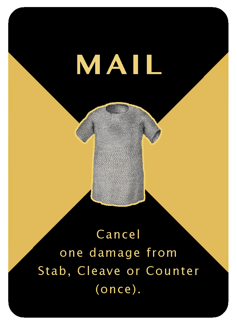
In this series of posts, I walk you through how to create your own custom playing cards for your game designs using an example from one of my own games. This is part three and is about the final touches. Part one is about the initial preparations and Part two is about coming up with the visual designs. The end result is a deck of high quality custom designed playing cards for your very own game.
Part three: Final touches
With great designs done for card backs and for the 20 duel cards, it was time to look at the remaining 16 cards.
Each player gets a set of either Saxons cards or Angles cards. These are the fighters, their equipment and their wounds. Players use them to keep track of damage to fighters and equipment. While I had already designed different card backs that clearly indicated the sides of the cards, I also wanted the front sides to be different.
First I was playing around with adding shields on the Saxon and Angles cards to communicate which side they belong to. But it didn’t really work out. Where to put it and what size? So I got the idea to make them as large as the cards and use them as background. I knew this would cause issues with especially the Angles side as I would have to have text running on top of a high contrast red-white transition. But I decided to try it out and see how it looked.
For the Saxon cards, I managed to have the text sit on top of the black background areas. But for the Angles background, there was no getting around the vertical red-white transition. I took down the contrast a notch by making the red a little lighter and less saturated and pushing the white into an off-white. This was enough for me to decide to go for this design. I knew I had one more trick up my sleeve: adding an outline.
How to outline text in GIMP
If you have text or images that run across different background colours, add a little outline to make them stand out. I didn’t learn this trick until last year. It’s fiddly but you can do outlines in GIMP. Here is how.
Duplicate your text layer then select Layer/Layer to Image Size. Then with the Fuzzy Select Tool select the area around the text. In Tool Options, switch mode to Add to current selection and select the areas inside the text. Then open Select/Border and then go for 2 pixels smooth border style. You may have to experiment here to find what works best in your case. Then do a Bucket Fill with Fill whole selection of the outline contrast colour.
As this also fills the border at the image edge, I trim the layer using Crop to Selection then Crop to Content after marking a new rectangular selection.
Next iteration would be to commission an artist to create drawings of Uffe, the Saxon prince, the champion and their equipment.
Step away and sleep on it
If you have gotten this far, it is time to step away from your work. Sleep on it. Print it. Show it to family and friends. Listen to feedback. Trust me, you will find typos and a thing or two you want to change. So let the designs mature a little. Then create the files for the printer. File/Export to PNG to a separate output folder. Be sure to hide your template layers! Double check names. Run through the PNG files in preview. Print a couple. Fix any issues you find. Then you are ready to upload to the printer.
Order the cards
I use PrinterStudio.com to print my custom cards. It would be great to have a service that shipped from within EU but I’m very pleased with the consistent high quality I get from Printer Studio so I accept the higher shipping cost and longer delivery times.
Register and sign in. Then go for Custom Game Cards and pick the size that match your template. For Holmgang it’s 63x88 mm Custom Cards. This time I decided to try the plastic cards. It’s a small deck and I expect them to get lots of wear and tear. Standard (smooth) is what I usually choose. For Size of Deck I select 36 and press the Personalize it button.
Next I click 'different images' for card fronts and upload the PNG files I have prepared. With 36 cards just drag and drop the files. With a larger deck, it can pay to prepare the files so you have exactly one image per card and have them named so they appear in the order you want.
Press that save button now and then. This is a web application.
When done, press next step. Skip Add Text to Front and do Customise backs. You will get a nice preview at the end to make sure that all card fronts match the correct card backs.
Click the confirm checkbox and press add to cart. Then fill in the order details, pay, and wait for your package to arrive!
The final result
Two weeks later a courier delivered a package at my doorstep with three decks of cards of Holmgang. Great quality.
This is the first time I try plastic cards. These are more expensive but as the decks hold fewer cards and I expect them to get lots of wear and tear, I wanted to try them out.
Which I instantly did; I had a first game of Holmgang with my 10 year old daughter and she was laughing and enjoying the duel. Next is to get lots more playtesting going and see if I want to do an updated version of the cards and maybe pitch the game to a publisher one day.
Best of luck with your own game design projects!

